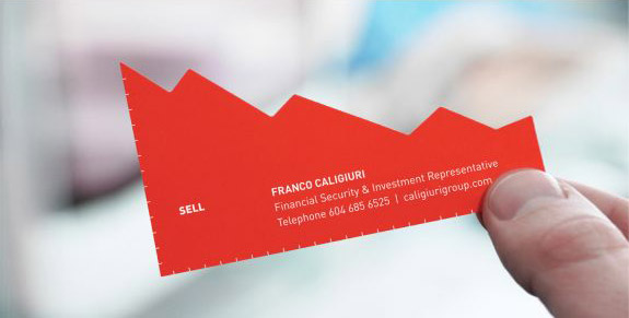
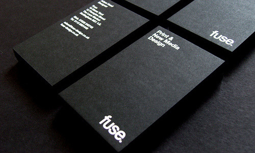
Just patiently ponder this situation, suppose you, in serendipitous conditions, find yourself in a meeting which involves the industry leaders in your area of expertise. And when the time comes to swap contact information, would you dig your deep pockets for your phone, unlock it and then wait for them to call out their number? Or would you just pass your chic business card to them?
A business card is an essential part of any business. Whether you work for a startup or a cross-country conglomerate, your business card would come more than handy to you. If you don’t have one, there is not a better time to get your customized inexpensive business cards. Here are some tips to make your business card stand out.
Make it Memorable

Business card can look like anything, but one important thing it should not look like is unprofessional. However, when the card is designed, who, what, where and why of the business should be on the card in an eye-catching location. The font again should be simple and readable. All of these decisions should be made with the space constraint in mind, so that the card does not look cluttered. You might be tempted to reduce the size of the text to make space of other elements, but remember if the text is not readable the purpose of the card is defeated.
Make Online, Meet Offline

If you want to save space by not printing your online information on the card, then a QR code would be a good choice. Now, QR code generators are extremely popular online, so getting hold of them wouldn’t be too much of a problem. They save space and also immediately direct your user to website if he manages to scan your QR code.
Power of Colour

The colour coding used in the card solely depends on the corporate and what they stand for. Bright colours can make some company business cards just stand out. It is easy to get these custom designed coloured business cards online in India. These personalized cards can be procured with minimum hassle with just few clicks of a button. Implementing a design on paper never got simpler thanks to advancement in technology.
The cards though must be designed with a strong understanding of colour structure. If you pair contrasting colours with each other, then you would not get your desired result. There are number of online colour matching tools which you can use to choose complementary colours for your cards.
Quality Matters

The cost of the paper material rises with the thickness of the card. You wouldn’t want to have a thin business card. It’s important that you do not cut corners at this juncture, as your business card is your
first impression. And developing a good first impression is half the battle won.
With Inkmonk, you can get any number of sizes and shapes, be it the standard size, or other custom sizes, Inkmonk can help you find a supplier who can meet your personalized demands.
Things to Remember While Designing your Business Card
- Remember to work on a 1039 x 697 pixels document o get a standard size, 84 mm x 55 mm card. Images that you would be using in these standard size cards would have to be at least 300dpi for best results.
- If you are preparing a business card with a coloured background, then you have to demarcate a bleed area for your card. The bleed should be designed to be in the same colour as the background of the card. This ensures that the edges are smooth and don’t have an odd colour standing out.
Everything from colour, thickness of the material, the design to the actual printing, is within the reach of any startup. It is easy to customize all of the above and get a quote with just a few taps of the mouse. With all these resources at hand, what are you waiting for? Get your customised business card or other customized corporate gifts today!

