
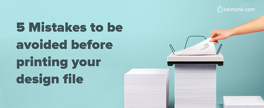
When designing for print, you need to consider many factors because there is no ‘Undo’ option once that delivery box arrives.
But don’t panic! In this article, we’ll walk through a handy checklist of the principal things you need to think about when preparing your work for print.
It’s good to have ’BLEED’

I know how the heading sounds, let me put it straight. Bleed is the area that is going to be cut off by the cutting machine, When you are designing, you should make sure that your background image/background color is extended into the bleed area – beyond the cutting line. So when it is cut you will not have any white trims on the edge of the design.
Go for CMYK
Can colors be a problem? In printing, they can be. To avoid color issues, first, make sure your files are converted to CMYK. Do not use RGB colors or Pantone. Despite seeing no differences on screen, the printing difference can become drastic and it can make or break your design!
This how you can change your color mode
 In Adobe Photoshop
1. Open new File
2. Set the size of your image
3. Select “CMYK Color” from the Color Mode drop-down menu.
In Adobe Illustrator
1. open a new file
2. If Advanced Options are not visible, click the arrow next to “Advanced” at the bottom of the window
3. For Color Mode, select CMYK
Typography matters
I understand wanting to get as much information on your design as possible, but no one is going to read your content if the font is too small.

- As a rule, you will want to avoid using the font size smaller than 8pt for print (smaller will be unreadable in print).
- Use 16-18 point font size for commercial print as this is easily readable by all types of audiences.
- Limit the number of fonts you use in one design. Try to communicate as much information with images.
- Avoid fonts that feature fine lines, as they easily disappear depending on factors like font size and background color.
Increase the Resolution

Low-resolution images produce blurry, pixelated print results. High-resolution graphics, by contrast, will look sharp and crystal clear when you go to printing. The biggest differentiation between the two entities is PPI, also known as pixels per inch.
300 DPI resolution is the ideal one. 300 DPI is usually enough, except in rare cases where you need to print a high density image which is to be viewed at a close viewing distance, in which case it might need to be higher than 300 DPI sometimes.
Rasterize your text

If you send a layered PDF or PSD file to someone with the text layer in its’ original state, and they do not have the font, it could drastically alter the appearance of the image.
Fortunately, you can learn how to convert a text layer to an image in Photoshop CS5.
• Open the file containing the text layer that you want to convert to an image.
• Click the desired text layer from the Layers panel at the right side of the window.
• If your Layers panel is not visible, press the F7 key on your keyboard.
• Right-click the layer, then choose the Rasterize Type option.
There are other factors like cracking, borders, banding etc., which should be taken care of. If you use the above list as a checklist for your print projects, you’re going to create professional-standard, error-free print documents that will make your printer very happy!