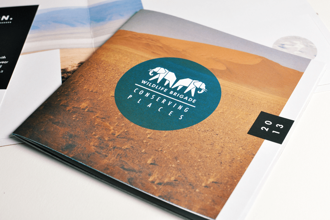
Brochures are an effective way of communication when it comes to marketing your business. An aesthetically designed brochure clearly conveys what your company stands for, its objectives, products and services and any other information that may be sought by your prospective clients and customers.
A brochure is a kind of pamphlet with text printed on a single page that is bi-folded, tri-folded, c-folded or z-folded. We can find a brochure almost everywhere these days- be it book stores, super markets, restaurants, offices. You might have been even handed over a brochure at public places or while travelling in public transports. Printing a brochure is not only economical but effective too. It is a gateway to garner attention from people you like to deal with in business. But, the trick is to find out how your company’s brochure can stand out from that of your competitors. To help you out, we have jotted down five experts tips to plan and design a stunning brochure.
Focus on Objectives

First and foremost, ask yourself a simple question what is the need of the brochure? Or what purpose will it serve? Is it for launching a new product or service? For Promotion? To declare a contest? To start a campaign? An event? Or just a tool of advertisement?
Only when you have a clear idea about the objective behind printing the brochure, you can decide on its content, design and layout that would suit the requirement best.
Keep Your Target Audience in Mind

A company’s strength lies in its customer base. So, building a good rapport with them and understanding their need should be your first priority. Brochures, being an effective communication tool, serve to bridge this gap between you and your clients or prospective buyers. It is important to have knowledge about your target group. Who you are writing to and in what ways your company can be beneficial to them, can actually help you decide on the type of language, choice of design and message you want to convey through the brochure. To draw maximum attention, your brochure should be able to trace the thought pattern of readers. It should be able to answer all possible queries that might pop up in their head about your company, business or product.
Draw Attention with Design

An effective way to grab people’s attention and make your brochure easily noticeable is to design it in a unique fashion, emphasizing specifically on the cover page. Let us consider that your target group has short attention span. In such a case, if your brochure is not eye-catchy, it won’t excite them to actually flip through the remaining content. In a way, your brochure will lose its purpose. To avoid this, remember to use a creative design layout, attractive colours and fonts. These are the elements that would help most your brochure to grab those eye-balls. Moreover, bold and interesting word-play and stunning images can add an extra edge to the brochure.
Concentrate on Precise and Sharp Content

A stunning cover design is often not enough to make your brochure look appealing. People may pick it up, but may not like to read through its lengthy, complicated paragraphs. They would rather prefer something that is short, sharp and serves the purpose right away. Brochure, being a piece of literature, its content is one of the most important elements that make it worthy. The content of your brochure should delve in addressing your objectives and disseminating all possible information your potential customers or business partners may seek. One easy way to do it is to organise your data and answer questions they might raise while reading the brochure. You may include a brief history about your company’s glorious achievements in the past too. But never deviate from your objective. Make use of bullet points and simple language. Divide the content with clear headlines in sans serif font and put larger pieces of information in serif font. To make it more interactive and interesting, substantiate your content with infographics, charts and images.
Add Call-to-action to Engage Customers

Never take your target audience for granted. Even after you have managed to draw their attention to your brochure, it’s important to engage them in your business. But wondering how you would make them avail your service or buy your product? Don’t worry for a simple call-to-action can do the trick. It is foolish to assume that customers would look for your contact details in the brochure and get started on their own. Remember it’s you who have to invoke the interest in them. Simple examples can be -use of active voice in the content rather than passive form of addressing your readers. Tell them to call or log on to the company’s website to place an order for the products now. Make it sound more real-time. Let them know you wish to interact with them in person.
Hope these points will help you in coming up with a better brochure for your company in future. A good brochure is not only an effective marketing tool but also facilitates a deeper understanding of your company in minds of prospective clients. And if you ever worry about where to print those brochures, well, look for Inkmonk.com. It is one of the largest online printing platforms where you get to choose from an array of suppliers, a range of price options and quality products to suit your need. We assure to help you get a brochure worth keeping.

