We have been using a lot of buttons at Inkmonk. Here is the list of possible ways that a button could be used.
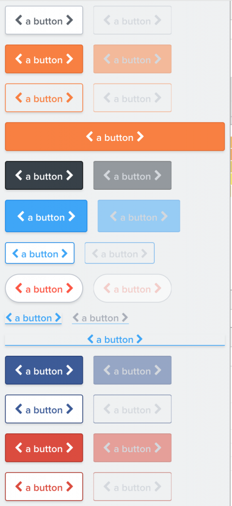
All of them are done by a single component that we call Button
There are a lot of features that determine how a Button should be rendered:
- button style (primary, secondary, danger, link, Facebook, google)
- button size (normal, large, small)
- is it a rounded button or a rectangle one?
- does it only contain a title or does it have icons as well?
- Does it have icons on both sides of the title or just one?
- Is the button in disabled state?
There are so many factors that play into how a Button is displayed on screen.
Here is the api of the Button we had:

Side note about the icons props:
Any icon name from FontAwesome V4 can be mentioned and the button will render that icon.
We had a huge JSON object like below that had definition for how a button should look in various circumstances.
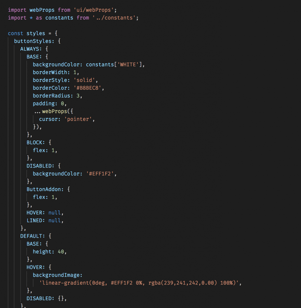
and all these objects will be merged together to create the style that will finally be applied to the button elements.
Every single time a button needed to be rendered on screen, there was so much object creation that needed to be done to compute the styles. Since we have been moving towards React Native and react-native-web for a while now, it has always been planned to rewrite the styles using react native’s StyleSheet implementation.
The thing about styling in react native is that we can pass styles as an array to the component. After rewriting the component to use StyleSheet api, here is how the style calculation for button wrapper looked like:
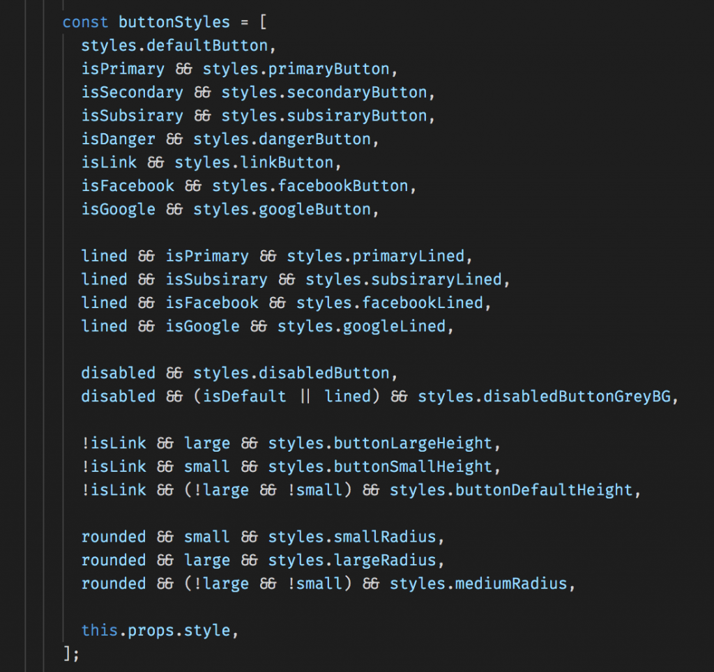
Here is how the above code works:
Each style is overridden by the rule that comes after it in the array, so we can start by defining some global styles in the beginning and get more specific depending on the rules.
1. First, styles.defaultButton is applied without any conditions. This sets the default background color, border, border radius, cursor and all that.
2. Next the button-style specific rules are added
3. Then, if lined prop is true, we need to show a lined version of the same button, so we override the necessary properties to get that.
4. if the button is marked as disabled, we add a global disabled style to the list to reduce its opacity
5. We then add button-style specific style changes to grey out the background under certain conditions.
6. Then we set the height of the button based on whether it is marked as large or small.
7. Then, we add style for rounded button. The borderRadius of the rounded button will depend on whether the button is in normal mode or large or small.
8. Finally the style prop to the component can override any of these values.
All of these changes are being done in the above code screenshot. And it is really efficient because the styles are not recomputed multiple times. The styles variable used in the above example has all the styles predefined. We are not doing plenty of Object.create() to compute the styles. All we do is add style to a single array, so we are not creating too many objects on each render method and bloating the memory. In the example that rendered 26 different types of buttons on screen, the JS memory heap reduced by about 2MB while using the new approach.
Before:
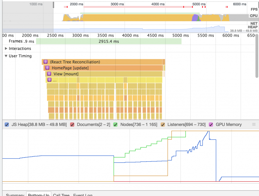
After:
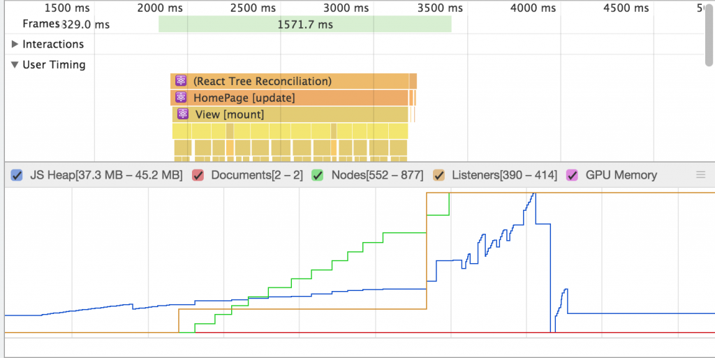
And the time taken to mount these components and render the button also went down drastically. Here is the before and after timings for mounting component in each of these approaches:
In addition to these, we made sure that the button could be rendered with 2-3 less nodes per button. This also brought down the load time and memory usage in a great way.
Before:
timing = [148.5,73.6,92.8,76.9,80.7,71.7,59.7,67.5,81.4,90.3,67.4,81.5,61.2,67.4,105.5,76,68.2,67.9,90.8,88.5,73.4,85.5,85.8,91.3,67.6,56.7]
Average time taken to mount a Button = 79.91538461538461 ~= 79.9ms
After:
timing = [38.6,45.9,41.3,28.1,32.6,30.3,44.6,32.2,38.6,40,43,46.3,51.5,45.2,44.1,45.6,39.3,30.8,42.1,26.8,28.5,37.7,53.8,36.3,47.5,37.7]
Average time taken to mount a Button = 39.55384615384615 ~= 39.9ms
[These timings were recorded by running Chrome with 6x CPU slowdown]
The time taken to render the button went down by 51%.

This change cleaned up so much of the code. We were able to cut down around 300 lines of code while still retaining the same functionality and reducing the time taken to load the button in half the time.
We will be rolling out this change soon to the website and iOS and android apps (Oh, btw, the same code is used across both web and native. So you’ll be seeing significant improvement to the Buttons rendered on screen in the iOS and android apps as well).
pro tip: you can use css to change the visual style of the button depending on its class. e.g.
aaargh
button{
color:white;
}
.angry-button{
background-color:red;
}
that way, you don’t need to load several megabytes of javascript and waste 80ms of precious time. also it works on all platforms 🙂
let me know if you need any more web pro tips
Ah, the good old days of using plain css.
But in our case though, the web app and ios and android apps are all running from the same code. So we had to define all styles using react native’s StyleSheet api in order to be reuse code across web and native.